Project
Info
The Brief
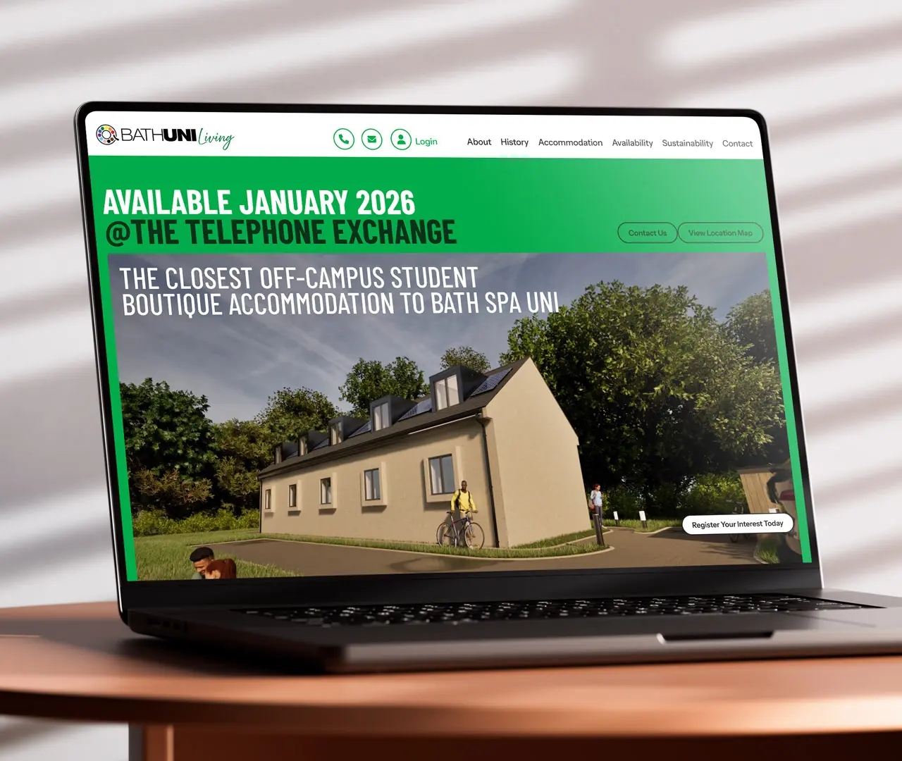
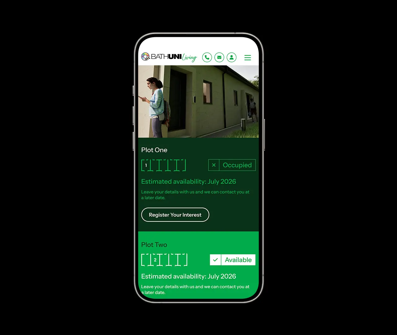
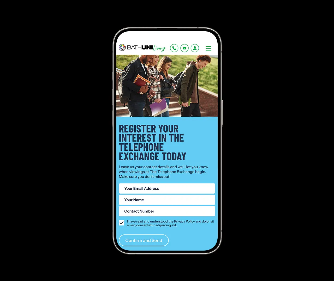
BathUNI Living required a bold and inclusive look to launch their newly developed student accommodation in Bath. The project was built upon the old telephone exchange building, which was overhauled and upgraded into a quiet and welcoming location for students attending Bath Spa University.
The Solution
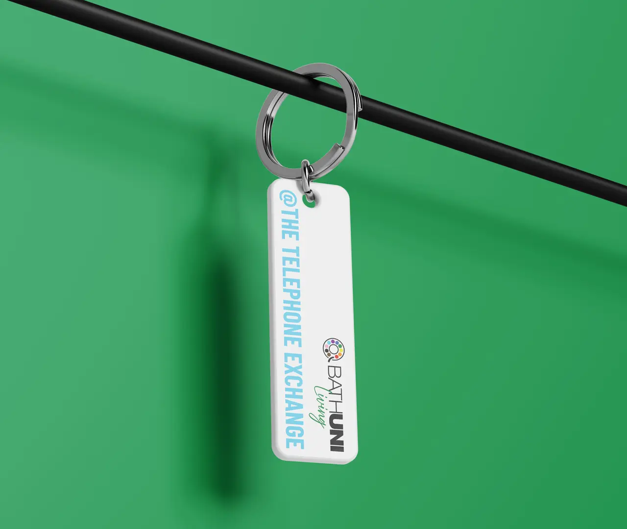
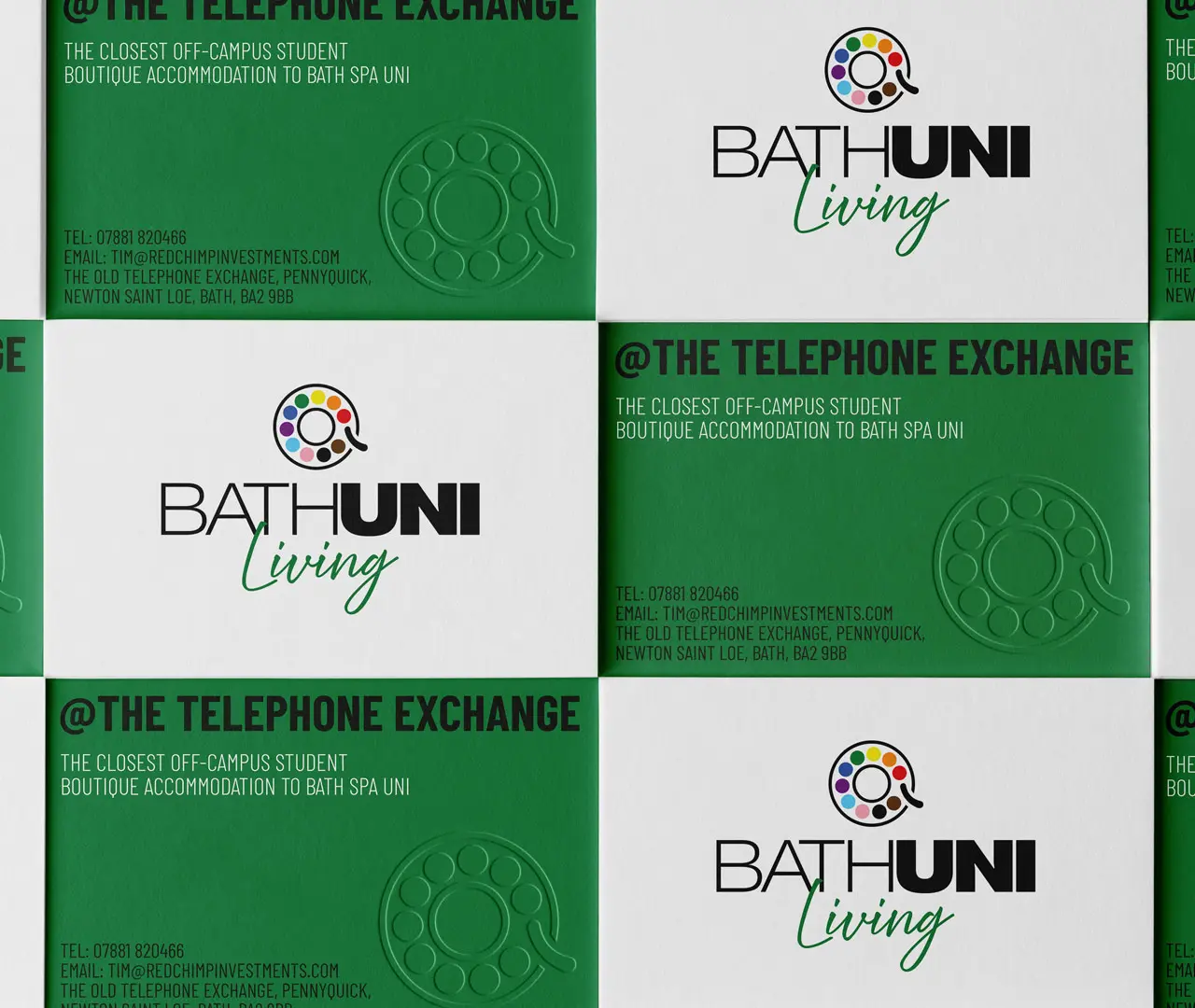
Taking inspiration from the converted telephone exchange, a logomark derived from rotary telephones was created which featured colours used in Pride flags and other symbols of inclusivity. This spectrum of strong colours represented the makeup of a diverse university demographic and gave each page of the website impact and energy. This was matched with tall and bold typography.
The Outcomes
<Insert stats from launch, traffic, social interactions? Or is this to focus on the design outcomes such as great new site, strong unique brand/place in the industry, and recognisable packaging?>